Skip to content

Case · Launch — 0 → 1

Triple F

Brand, coming-soon website and social media strategy for a 100% gluten-free fried-fish shop in Madrid.
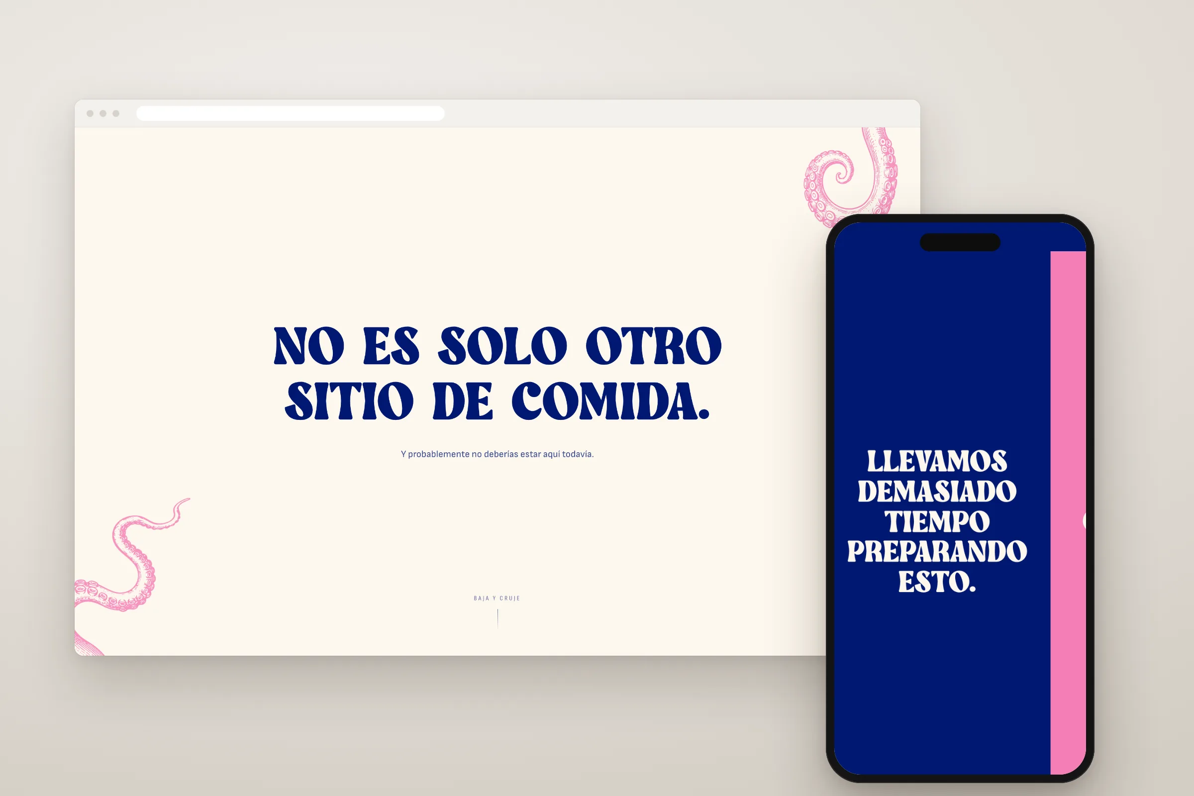
The Triple F coming-soon website in a browser, ‘No es solo otro sitio de comida.’ (‘It’s not just another food place.’) among pink tentacles, and on a phone, ‘Llevamos demasiado tiempo preparando esto.’ (‘We’ve been getting this ready for too long.’) on navy blue.

Something’s frying.

Some projects are written up once they’re finished. This one is still in the fryer.

Triple F is a new Madrid brand. Fresh Fried Fish, for anyone who wants the full name. They’ve been getting it ready for a while, and we’ve been right there with them.

Before the batter

We started by looking around: who fries in Madrid, how they talk about it and what gap is left. There was one. Quite a big one.

The brand

Then came the identity: a colour that isn’t the usual one, guidelines so nobody loses their way and a graphic system with something living underneath. We won’t say what. Yet.

And a cheeky voice. Cheeky with manners, which is harder: provoking without offending, showing off without boring.
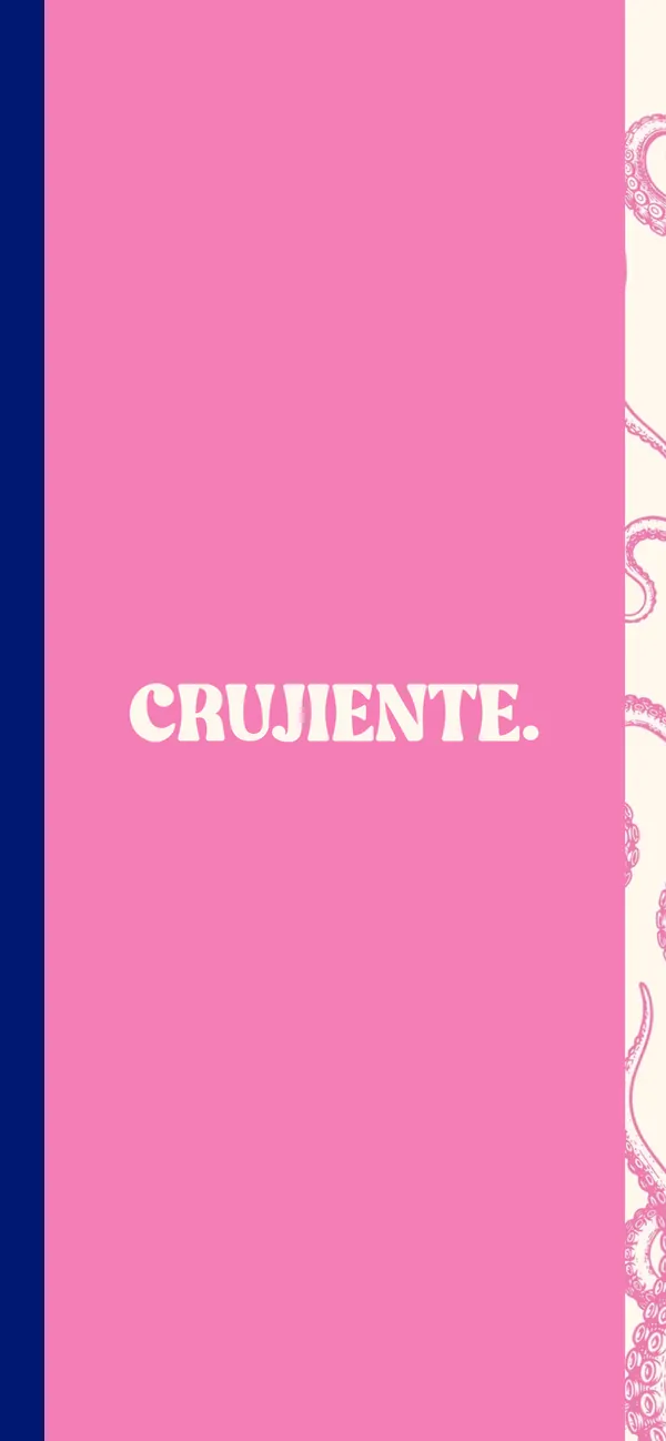
  • ‘Crujiente.’ (‘Crunchy.’) in white on pink, on the Triple F coming-soon website on a phone, with tentacles poking in from the edge.
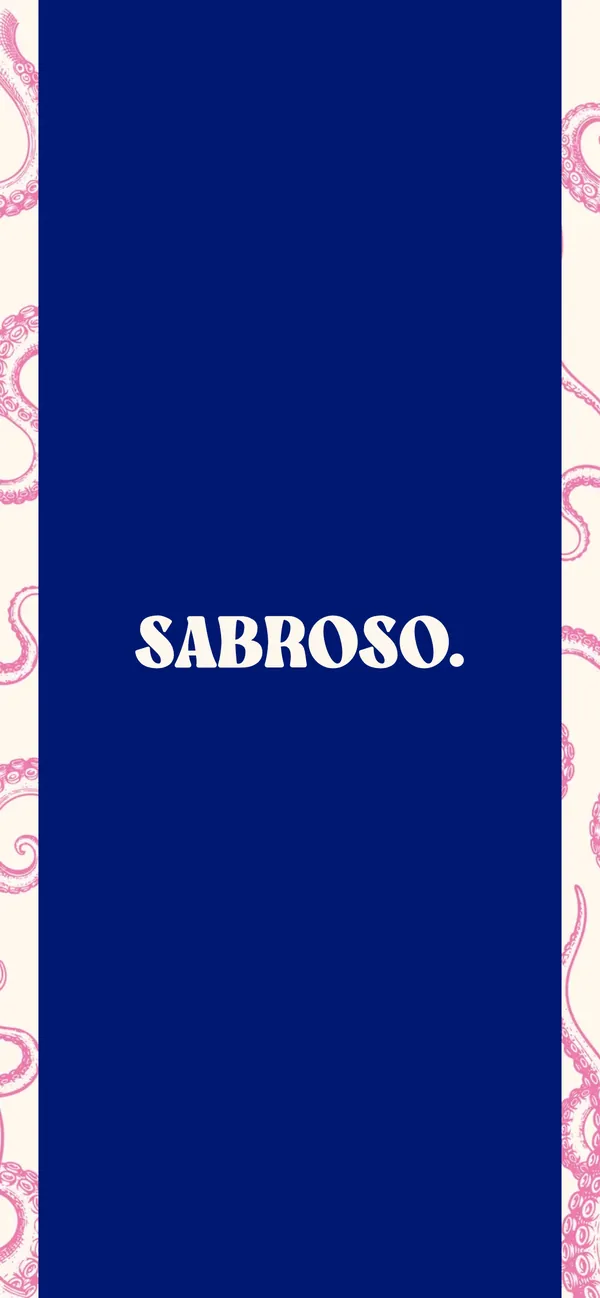
  • ‘Sabroso.’ (‘Tasty.’) in white on navy blue, on the Triple F coming-soon website on a phone, between two bands of tentacles.
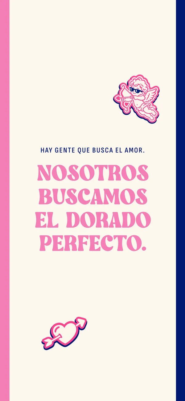
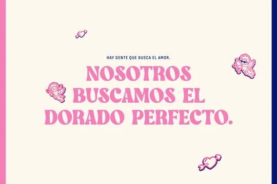
  • ‘Hay gente que busca el amor. Nosotros buscamos el dorado perfecto.’ (‘Some people are looking for love. We’re looking for the perfect golden brown.’) in pink, with a cupid and a heart pierced by an arrow, on the Triple F coming-soon website on a phone.

The wait

For now, the website shows next to nothing. That’s how it should be. There are clues, things you can move around the screen and a place to sign up and be the first to know.
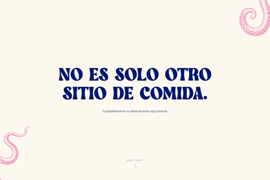
  • ‘No es solo otro sitio de comida. Y probablemente no deberías estar aquí todavía.’ (‘It’s not just another food place. And you probably shouldn’t be here yet.’), the home page of the Triple F coming-soon website.
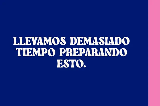
  • ‘Llevamos demasiado tiempo preparando esto.’ (‘We’ve been getting this ready for too long.’) in white on navy blue.
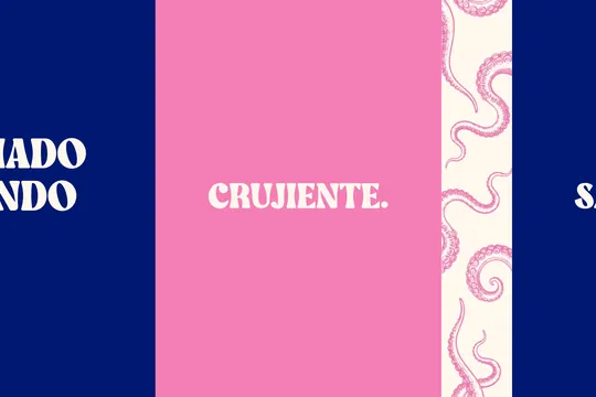
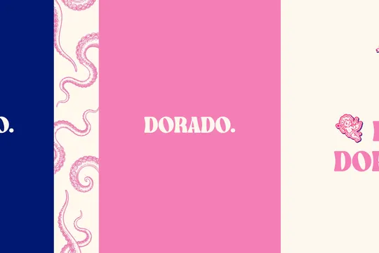
  • ‘Crujiente.’ (‘Crunchy.’) on pink, between the navy blue and a band of tentacles.
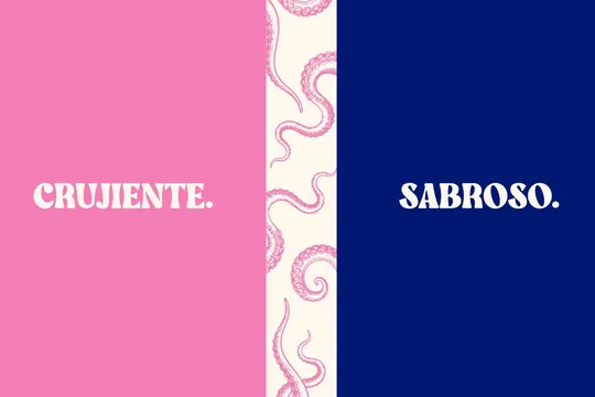
  • ‘Crujiente.’ and ‘Sabroso.’ (‘Crunchy.’ and ‘Tasty.’), separated by a band of tentacles.
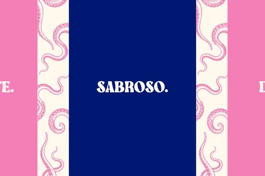
  • ‘Sabroso.’ (‘Tasty.’) on navy blue, between two bands of tentacles.
  • ‘Dorado.’ (‘Golden.’) on pink; a cupid peeks in from the right.
  • ‘Hay gente que busca el amor. Nosotros buscamos el dorado perfecto.’ (‘Some people are looking for love. We’re looking for the perfect golden brown.’), with two cupids and a heart pierced by an arrow.
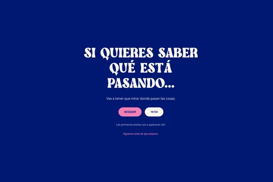
  • ‘Si quieres saber qué está pasando…’ (‘If you want to know what’s going on…’), with the Instagram and TikTok buttons: the first clues will appear there.
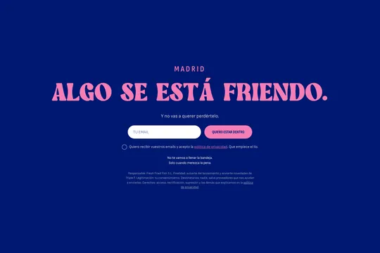
  • ‘Madrid. Algo se está friendo. Y no vas a querer perdértelo.’ (‘Madrid. Something’s frying. And you won’t want to miss it.’), with the place to leave your email and be the first to know.

The social media strategy is written and the calendar is ready. All that’s left is for the oil to heat up.

Some people are looking for love. They’re looking for the perfect golden brown. We’re helping them find it.

Coming soon.

Triple F’s website · triplef.es (opens in a new tab)

Other cases

  • Nattan

    Brand, online shop, SAP integration, content and campaigns for a new wellbeing brand.

    Launch · 0 → 1